December 3rd


Welcome
Hello and welcome back! I have another major update. We are reaching the end of the semester which means it's time for a new update. With this update I wanted to improve the player's experience and polish some of the rougher edges of this project. This is done by improving the lighting and UI elements and adding materials, audio, and VFX. I also added models I found on both Poly Haven and Fab to help make the house feel like a home. Without further to do, let's dig in to the details of the update and the design choices behind them!
Materials
Flooring
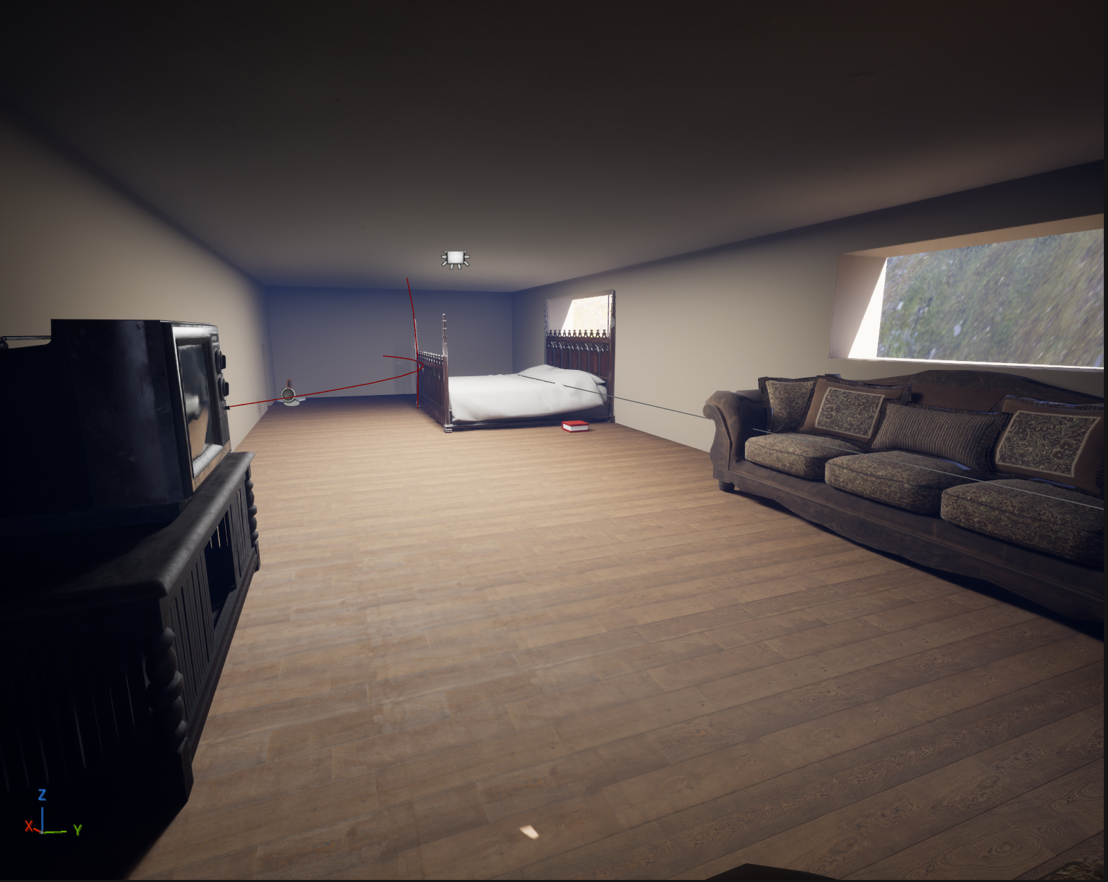
The first thing I worked on was the materials. I wanted the house to feel like a house the player would find in the real world. I decided that a wood flooring would work best. I felt the wood flooring would help with the player's emersion. It would give me an opportunity to add more interesting sounds for footsteps. It also would allow me to add ambient noises such as floorboards creaking. I decided on {insert link to wood material} this material for the flooring that I found on Poly Haven.
Walls
I decided to use this material on Poly Haven on the walls to make it look like they had been painted. Originally I had wanted to make each room have a different color similarly to what could be found in a real house. However I ran into a bug that made the walls become transparent when the new color was added to them. This meant that I had to keep all the interior walls the yellow beige color I started with. I choose the beige color because I felt it invited the player to explore more. The yellow in the beige brings a more cozy feel to the environment which helps emphasize the homey feel to the house.
Exterior
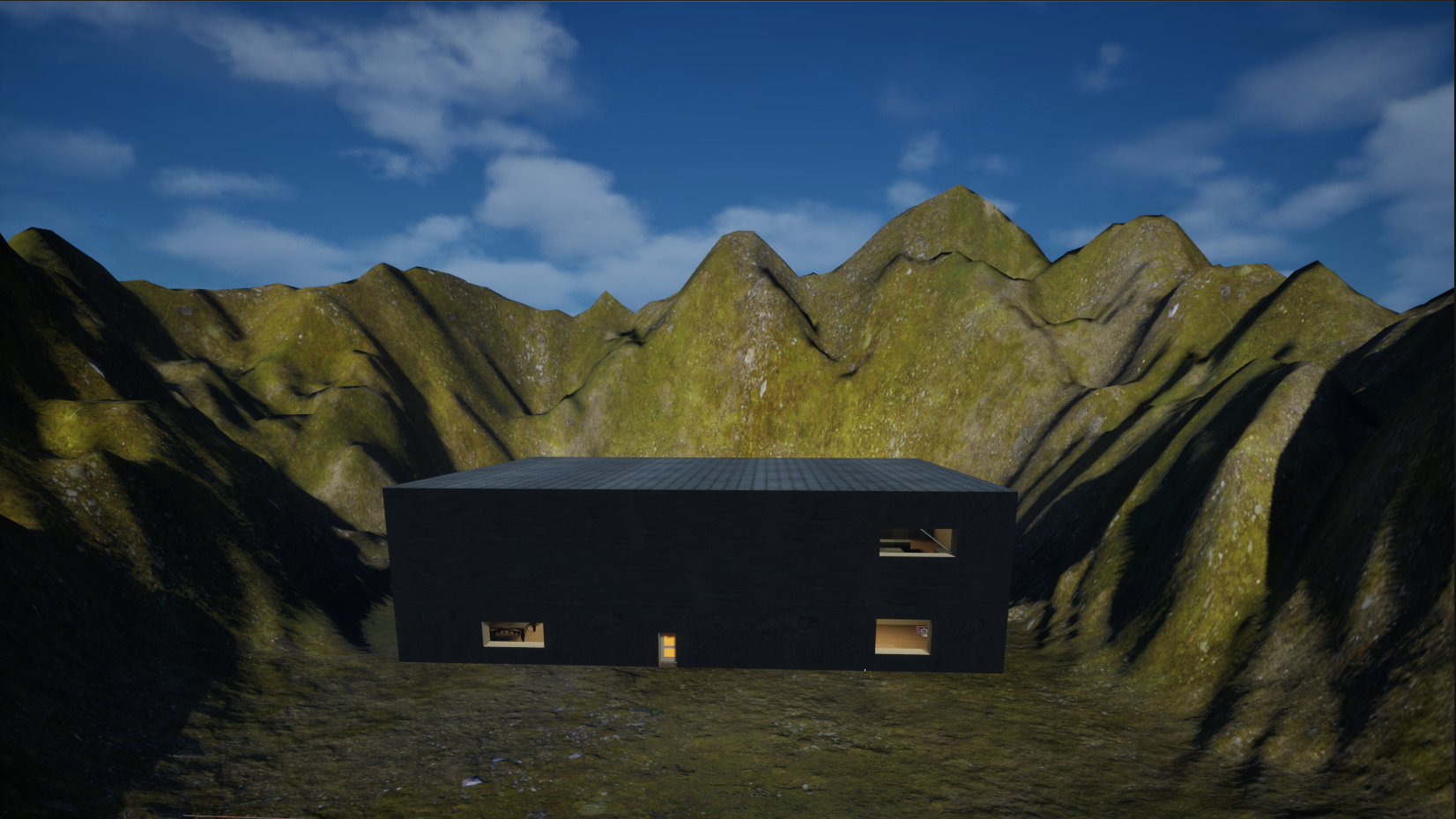
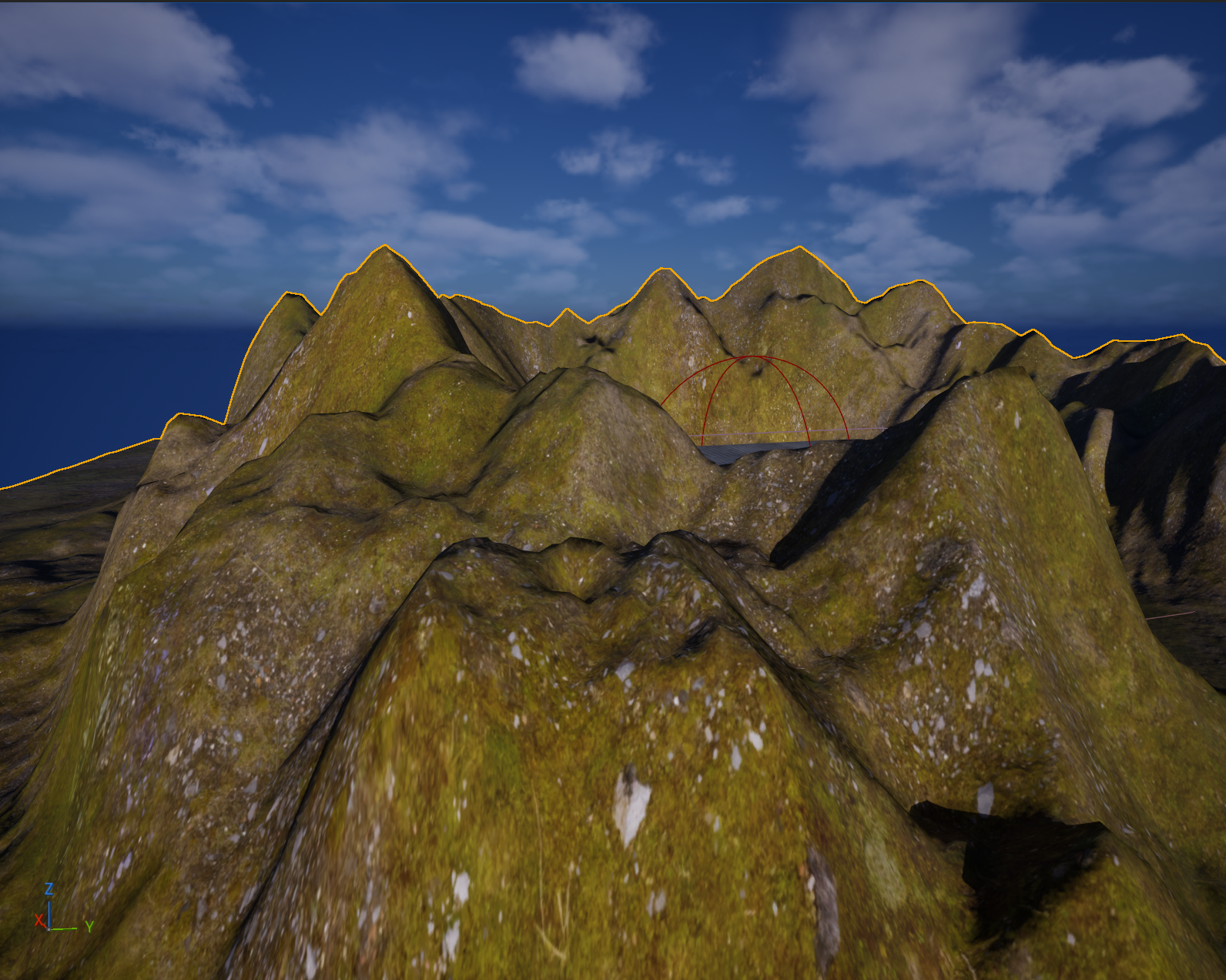
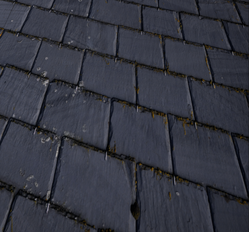
I decided to use this material from Poly Haven for the roof of the house. This is because I felt it looked closed to how shingles look without looking to urban. I wanted the roof to feel like it had dirt and grime on it from surviving the elements at the base of a mountain. I liked how the grimier bits between the tiles looked along with the material I used for the landscape. It helps make the house feel older and more lived in and less newly built.
I decided to use a material from Poly Haven for the exterior walls of the house because I wanted the house to feel sturdy. I tried a couple of other materials like one that looked more like a log cabin but these did not make the house feel as sturdy as I wanted it to be. I wanted the house to seem like it had been at the base of these mountains for a while.
Landscape
I decided to use this material on Poly Haven for the landscape because I felt it helped to make the house feel like it was nestled in at the base of a small mountain range. I think the green tones help the landscape to feel like it's alive while the brown spots help make the mountains more realistic. It helps to show the weathering on the mountains.

Lighting
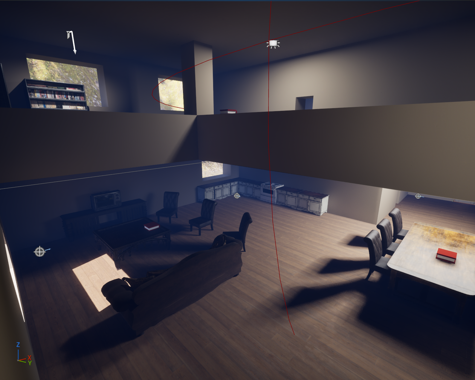
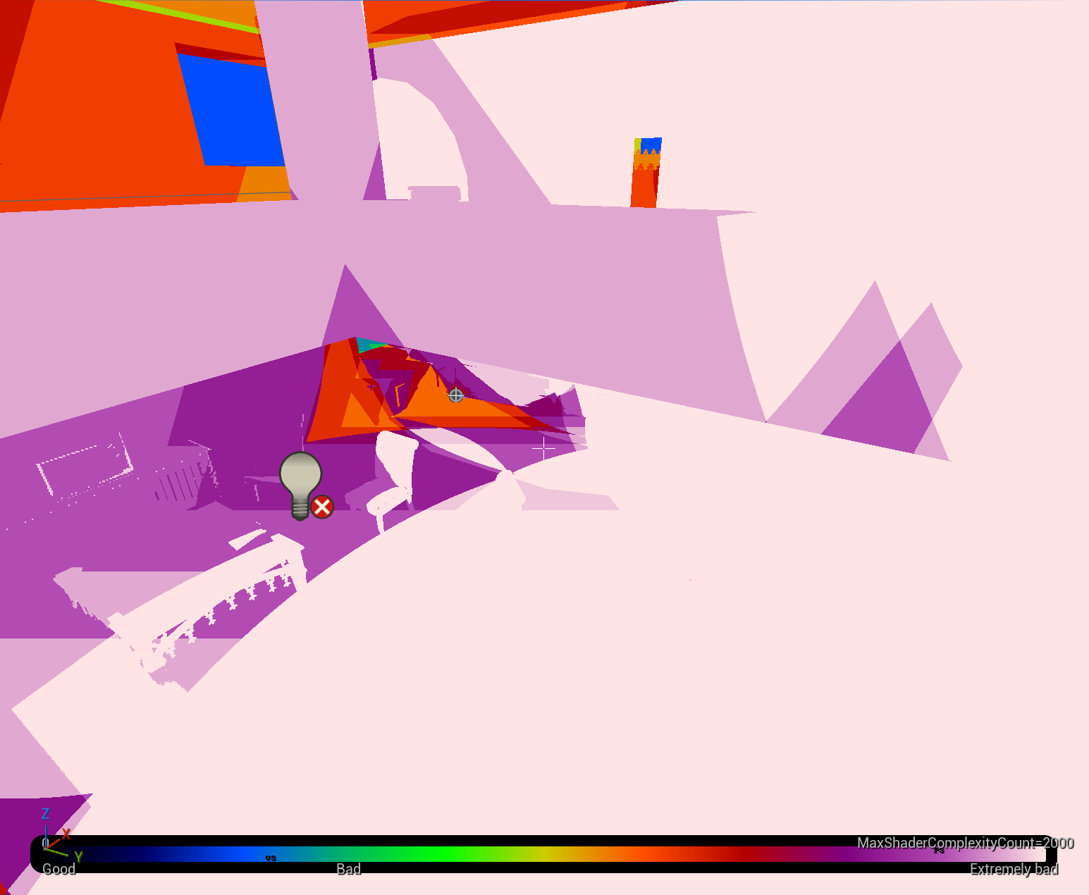
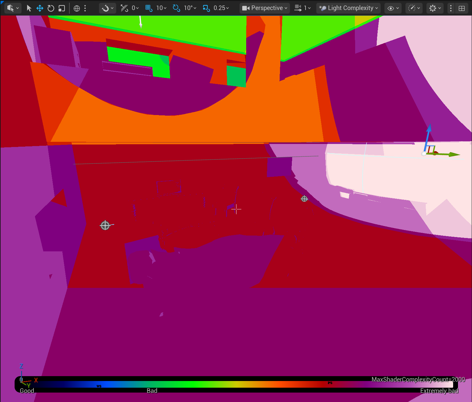
Lighting is one of the things I struggled with the most for this project. I had added lights to my project when I was blocking out the level. However this was done before I learned the best uses for each type of light. Because of this when checked the light complexity of my level I found that most of the house was either white or light purple which is not good. This light complexity showed that the lights were overlapping which caused more complex math to be done and as a result the level was not performance friendly. The picture below shows the light complexity map before I changed the lights.
I decided to completely restart with the interior lights. I added new lights into the level. I tried to make sure the lights didn't overlap however this lead to the level being too dark even after changing the exposure with post processing. The new light complexity of my level is slightly better however like most things, it can still be improved.
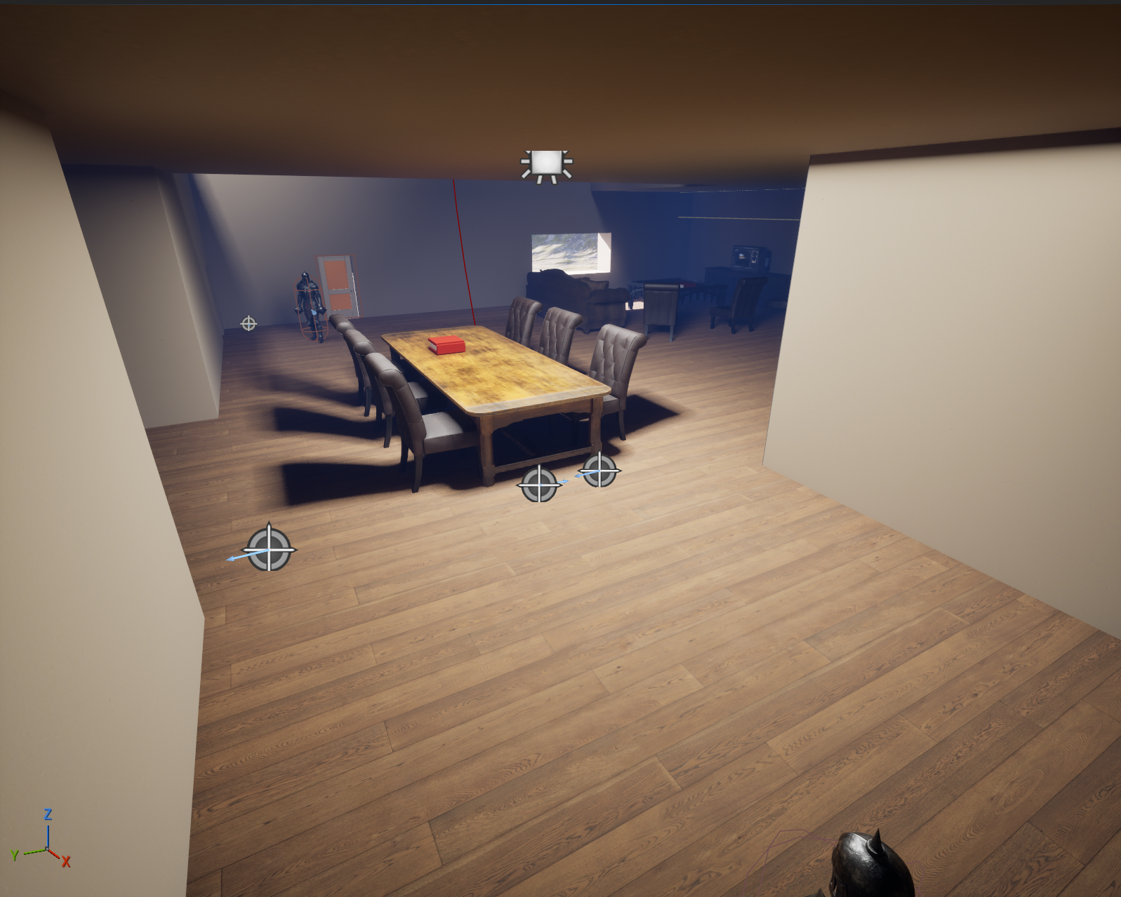
I decided to completely restart with the interior lights. I added lights to my level making sure that the house was lit like it would be in a real house. I wanted the lighting to feel like most if not all of the lights inside the house were left on. I also wanted to be sure that the player could still see the details and important aspects of my level. One of these things is the pile of gold hidden on the second floor. Initially it was tucked in a corner hidden by bookshelves with a point light highlighting the pile. However after changing the lights I felt the gold pile was not noticeable enough. I moved the pile out from behind the bookshelves so that the new lighting would highlight it better and make it less likely to be missed.
I decided that I wanted the lights to have a cool tone so I changed the color to have a slight blue tint. I did this because I didn't want the house to feel too safe or familiar to the player. Using the cool tones help to make the house feel more foreign. I also wanted it to feel like the game took place later in the evening. I changed the intensity of the directional light that acted as the sun for the level so that the level was darker similarly to how it would be in real life.
Post-Processing
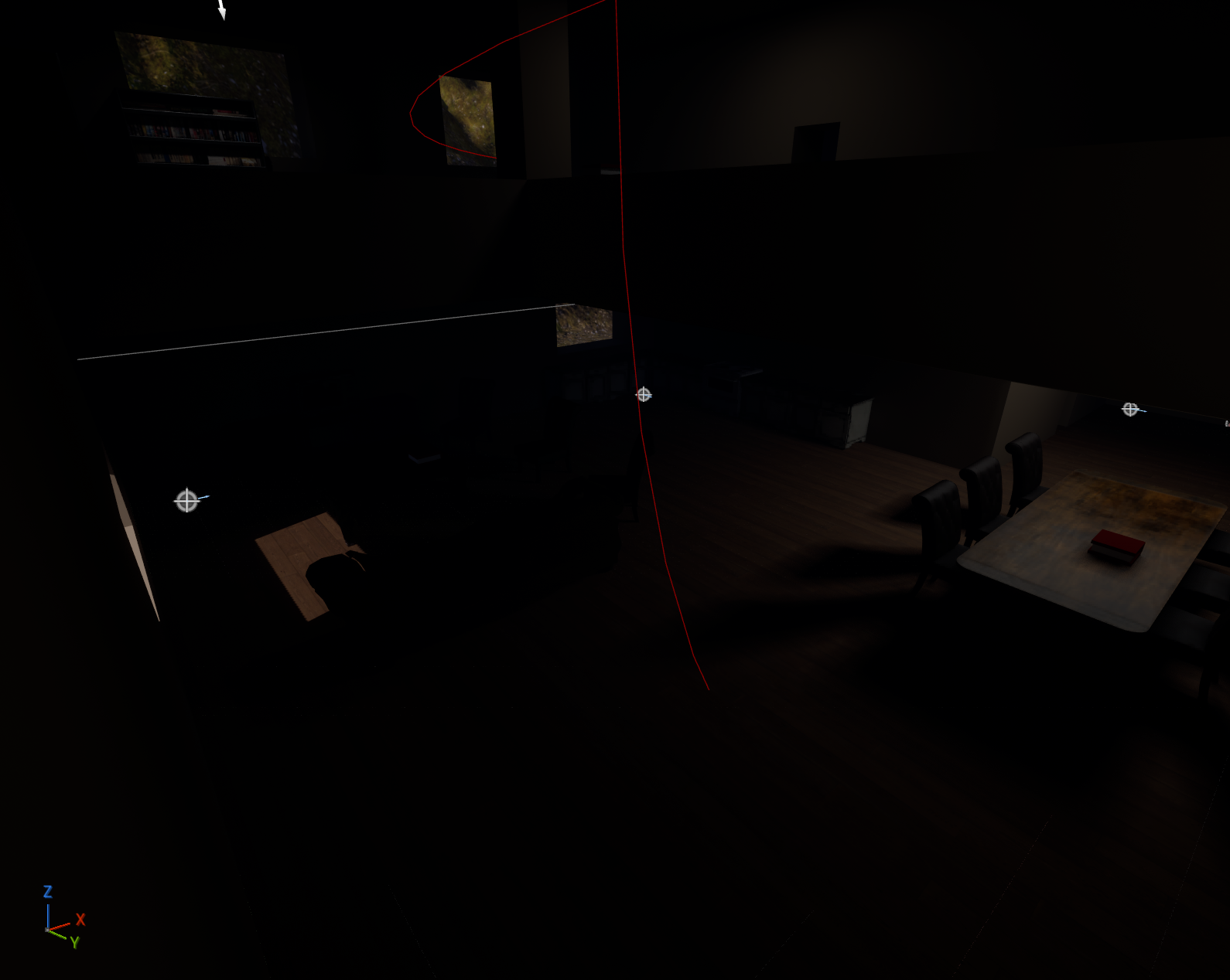
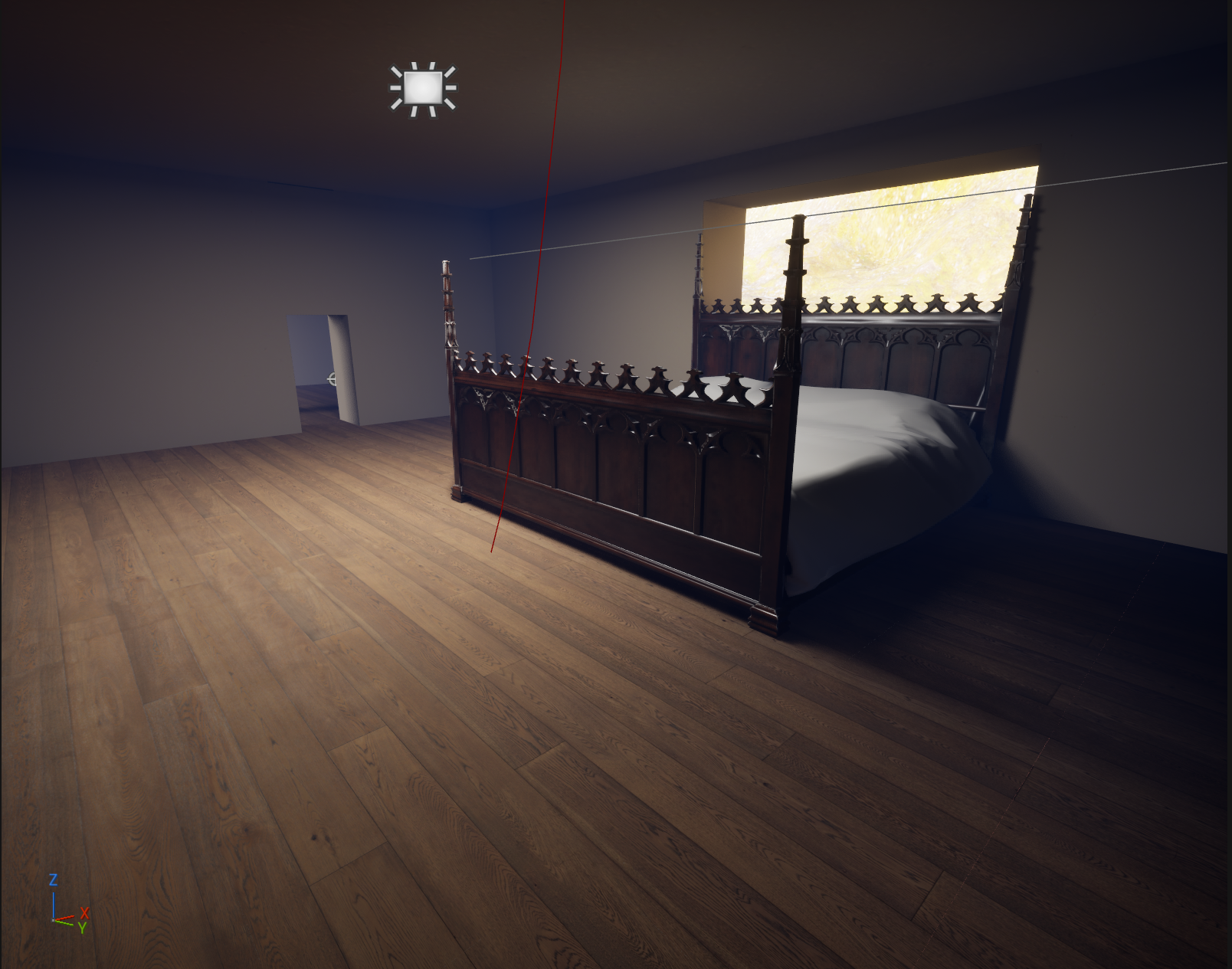
The biggest change I made with post-processing was the exposure. This was to help reduce the number of lights needed to light my level. I also changed the color grading slightly to help bring in the cool tones that I wanted for the lighting. I wanted the cool tones to help build tension by using color associations. In general cool tones feel less natural and more foreign. I wanted to incorporated these emotions in my game to help build tension around the weird house in the middle of nowhere. In the future I think it would be interesting to change more settings to see how they affect my game, however I ran out of time to explore post-processing too deeply. The first image below is the house without the post-processing affects applied. The second image is the same location with the post-processing affects.
Audio
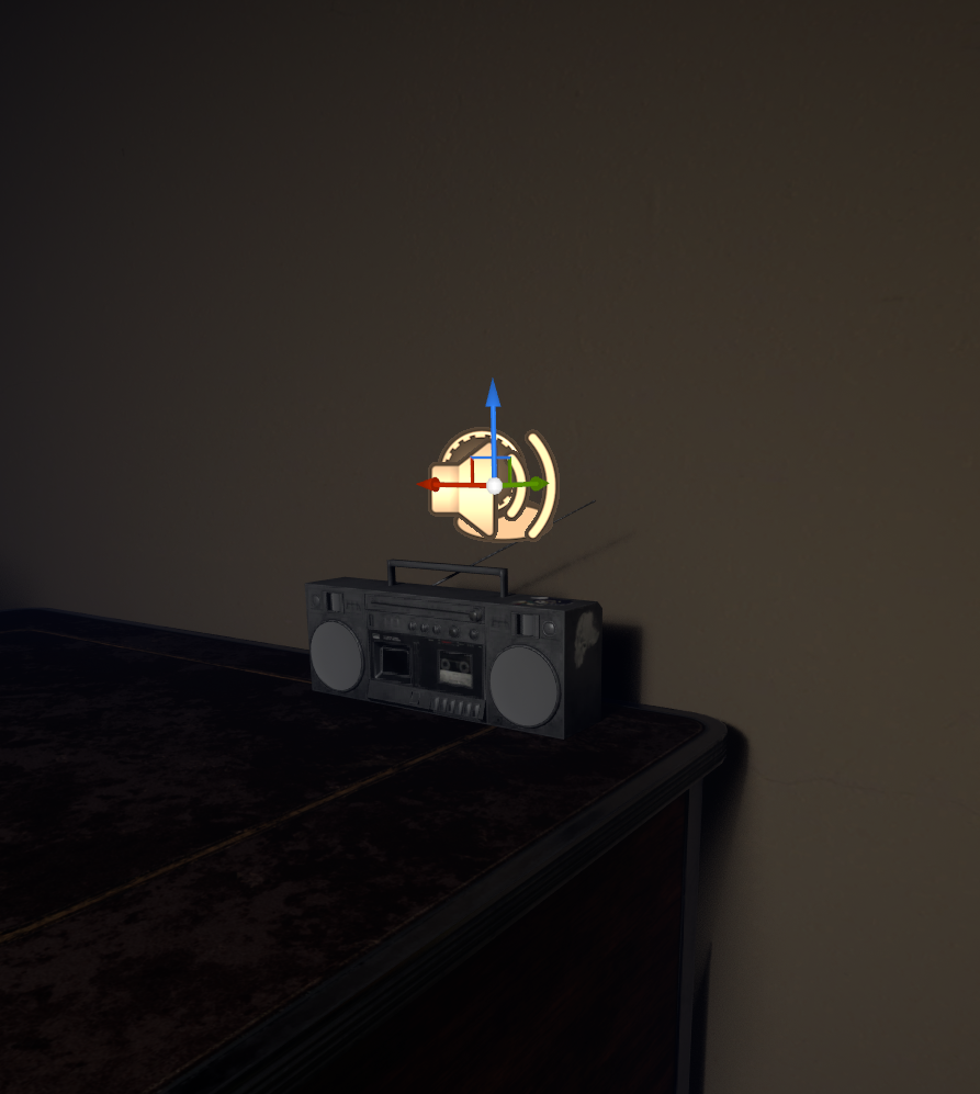
I added this audio from Freesound into my game. I thought it would be fun to add a small radio into my game and have it playing music that could be heard through most if not all of the house. This audio reminded me of older video games where the player had to explore a dangerous area. When I first heard the music it made me feel slightly on edge but it also made me curious. The funky sound made me want to explore the area. These were the exact feelings I wanted for the player. I wanted the player to feel the tension of being in a weird house in the middle of nowhere with people in iron suits patrolling the house while also wanting to explore the weird house and maybe find out more about why the house was there in the first place.
I originally wanted to add more audio for this update however I ran out of time. I plan on adding more audio in a future update. I want to add the sound of insects outside the house to help make the world feel more alive. I also want to try to add footsteps for both the player and the enemies. This will help with emersion since it's unlikely to not hear footsteps in real life especially when walking on wooden floors. I also think it would be interesting to add sound effects to the different actions a player does such as grunting when jumping or panting after dashing.
VFX
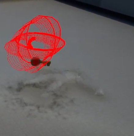
I decided to make a small burst that played when an enemy was killed. I originally intended this effect to be for when the player picked up an item but after testing and seeing the effect in the level I decided that it did not make sense. I wanted to add this effect show that the enemy was destroyed. After the enemy is defeated the death animation plays where the enemy falls to the ground. Then the burst appears as the enemy is destroyed making it look more like the enemy bursts into a cloud and dissipates. Then the key that all enemies drop is spawned.
The burst does emit a small bit of light. I kept this aspect because I thought it helped draw attention to the fact that the enemy was destroyed. This also draws attention to the key that is dropped after the enemy is killed. I did this in hopes that the player does not miss the key dropped by the enemy. I also wanted to draw attention to this so that the player could experience the satisfaction of destroying an enemy. I think this effect makes that accomplishment more satisfying. I made sure that this effect was not overused. This helps make the death of the enemy feel more impactful as the effect only happens when the enemy is killed. This effect also does not last very long. This helps with performance. I also switched 3 of the 4 controls in the effect to work using the GPU.
This effect went through many iterations. The first was from following this tutorial. I then placed it into my level so that I could see a more accurate size. I felt this size was too large for playing when the player picked up an item. I also created an easier way to see the effect for testing purposes. This was done by having the effect play when a button was pressed. After a while of searching for a way to lower the effect I found that the node that controlled the spawning of the effect with the button was what was causing the effect to spawn too high. After changing this the effect spawned where it should have. It was around this time that I decided that I could use the effect for the death of an enemy instead of when an item was picked up. I focused my efforts on making it more believable for the enemy's death. This meant that the effect area needed to be larger so make it more visible. I also fixed the colors with the effect because originally the effect had a black ring at the start and then white bursts out of the ring. Eventually after playing around with different sizes and colors I settled on the effect I have now.
Overall I like how this effect turned out. I think there could be improvements on where it spawns for the enemy. This is because it currently spawns at the enemy's feet instead of spawning in a more centralized location when the enemy is on the ground. I also think it would be interesting to add different effects to the enemy to show the amount of damage the player has done to the enemy for example possibly having blood drip when the enemy has taken 3 hits. I think it would also be interesting to add more effects to the player character such as particles when the player is running. I'm excited to explore more with how the VFX affect the feel of my game.
UI
Main Menu
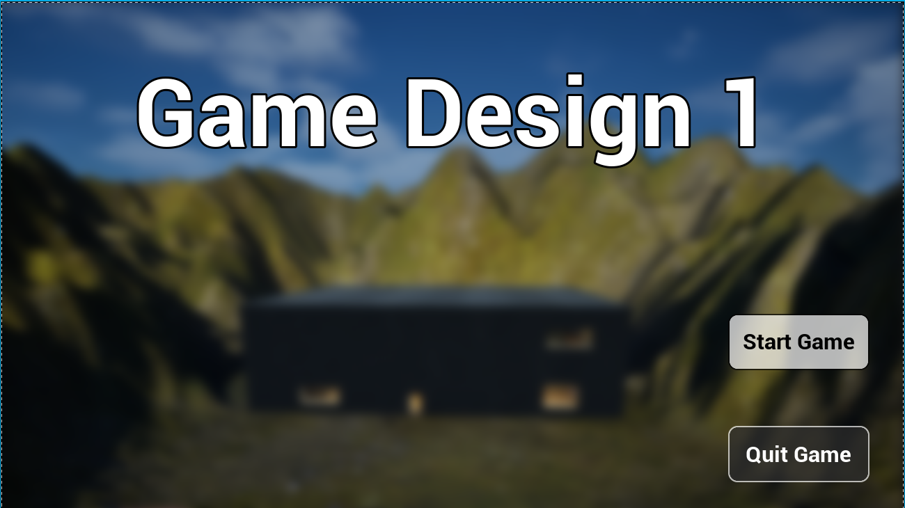
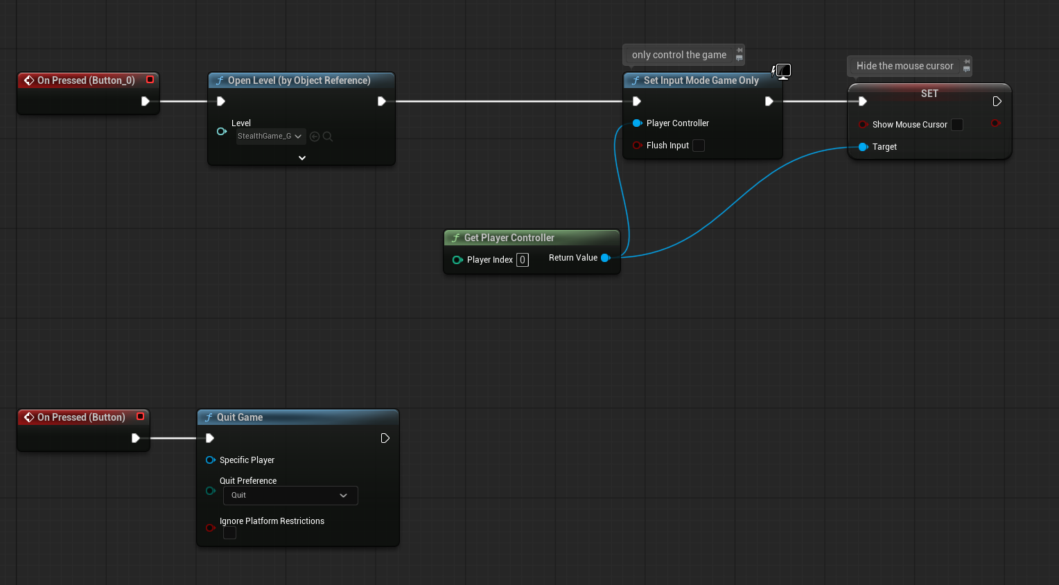
I decided to redo the main menu of my game because I did not like how the original main menu looked and felt compared to the rest of my game. I decided to have the main menu be a blurred image of the house and mountains with two buttons on the bottom right side of the screen. The top button is the start button which starts the game. The bottom button is a quit button which allows the player to exit the game. I decided on the blurred image because I liked the way the house looked nestled at the base of the mountains. I liked that it drew attention to the house and its remote location. I added the blur effect because I felt the image by itself looked too buys with the buttons also on screen.
I originally wanted to have the main menu start just outside of the house with the buttons on the bottom right of the screen. Then once the player hit start I wanted the screen to fade to black as the player hears thumping of feet hitting the ground. The screen would have then faded back in to where the game starts.
Pause Menu
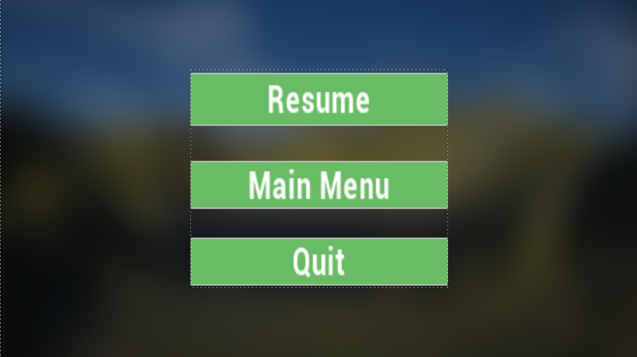
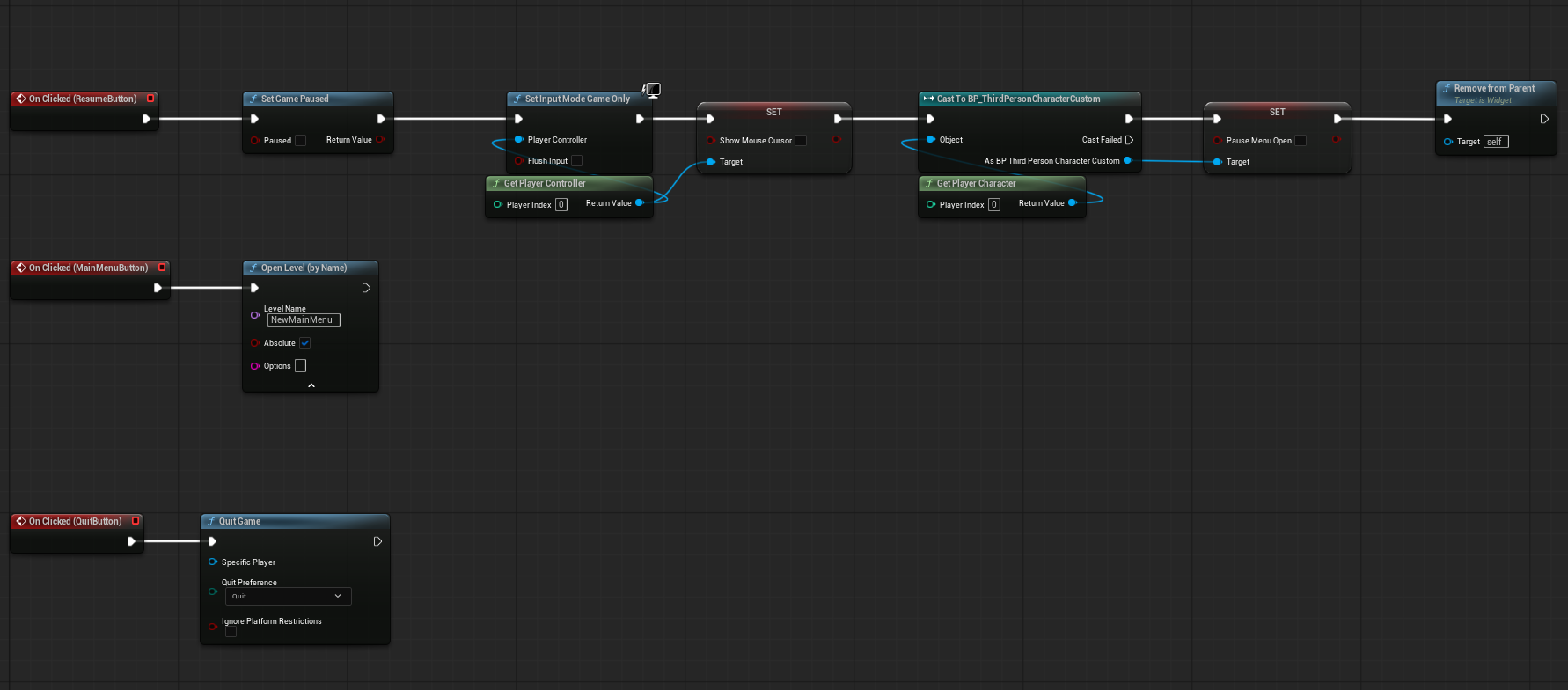
I decided to use the same image from my main menu for the pause menu however I decided to blur the image even more. I also decided to have three buttons stacked vertically in the middle of the screen. The top button is a resume button. This allows the player to return to the game. The middle button was to return to the main menu. The bottom button is a quit button which allows the player to quit the game however it does not save the game before the player quits. I decided to make each button the same shade of green. This is because I wanted to keep the natural feel that came from the blurred background while also making sure the buttons were still visible.
Conclusion
Overall I am amazed at how this game has turned out so far. I have learned lots during while making this game, and there are still areas in which I can improve. There are definitely things that I want to improve and add such as adding an inventory system and an easier way for the players to pick up items. I also want to dig into the story of this game more by possibly adding NPCs such as the family that lives in the house. This would help the player better understand why they are in this specific house and why it is so important that they complete their task. It is my plan on continuing this project in the future. That's all I have for now. Thank you for taking the time out of your day to read about these changes and my progress throughout the semester. I will catch you next time. Bye for now!
Leave a comment
Log in with itch.io to leave a comment.